For those of you that have a solar and Tesla Powerwall 2, you will note that the mobile app is very good at showing you current state and data from the prior day. However, data at the week/month/year is summarised so you can no longer see the granular data. So, how do we capture this data until Tesla add this functionality?
I’ve been a user and contributor of PVOutput (http://pvoutput.org) since the very day my solar system was installed (https://www.teslastraya.com/?p=67). Via the Enphase integration it uploads 5 minute data and is able to create very neat charts and graphs across your generation and consumption. As a contributing user, you can also input your energy prices and it will calculate daily/weekly/monthly/yearly costs.
The integration with the Powerwall 2 API’s unfortunately isn’t as straight forward. I won’t go into the complete technical detail in this post (however if you want this detail comment below and I will look to create a blog post!). It involves ensuring the Powerwall 2 is connected to your home wireless network and running some scripts on an always on Raspberry Pi. This queries the web server in the Tesla Gateway. This data is uploaded to PVOutput and graphed in a similar manner to my Enphase system.
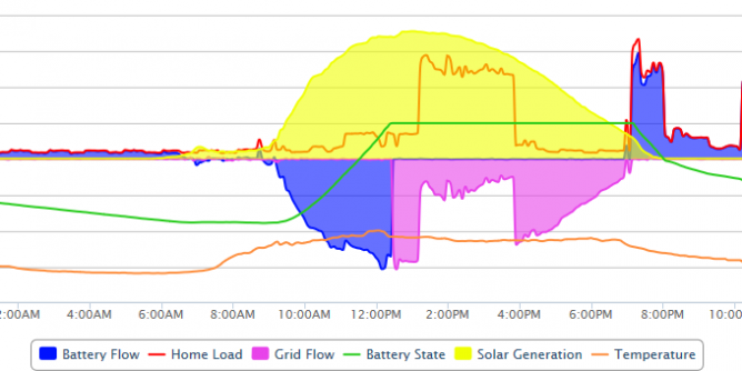
Solar Graphs
The graph above my look a little “busy” at first look so let me break it down:
- Blue – Battery Flow – below the line is energy to the battery, above the line is energy from the battery to the house
- Green line – Powerwall 2’s state of charge
- Orange line at bottom of graph – temperature – on this day it got to 40.3 degrees celsius!
- Pink – Grid flow, below the line is energy exported to the grid, above the line is energy imported from grid (there was none today!)
- Red line – House usage, the spikes you see is our ducted air-conditioning keeping the house cool
Some interesting notes from this day:

- The Powerwall 2’s were charged around midday which allowed excess solar to be exported to the grid, which was probably feeling slightly stressed on this day!
- Despite the heavy power usage, our solar was still able to export around 24kWh to the grid. This gave us some profit for the day, more on this on the graph below.
- The blue fill generally matches the red house usage line. This is the real time nature of the Powerwall 2 system detecting household loads and dispatching battery power to compensate.
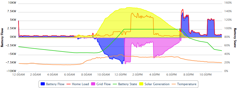
Differences between graphs
You’ll note that there are some subtle differences to this graph then the one that came from the Powerwall 2’s:
- During the hours where there is no solar production, there is no power used. That’s because as far as the Enphase system and energy meters are concerned there is no usage. The Powerwalls are doing their thing and powering my house. Even when you see the large spikes around 7pm and 10pm on the Powerwall 2 graph, it’s flat on the Enphase graph. Free power!
- You’ll note that on this day despite the very high power consumption I was still ahead by $3.66 .That’s a turn around of $18.07, for a single days usage. Over a hot Australian summer season that quickly adds up to savings!
- My record day was on November 11th, 2018. I was able to satisfy house loads, get 2 Powerwall 2’s charged and export some 54kWh to the grid for a profit of $9.75. This would be nice to sustain over a few weeks!
If you haven’t seen my previous post about my solar and Powerwall 2 set up, please take a look at that post here